Milano by PEX
A new chapter for the Milano's digital experience
Services
UX Research
Information Architecture
UI Design
Client
PizzaExpress
Info
Milano, PizzaExpress's Irish brand, needed to rebuild its digital experience across web and app. The existing site worked, but felt purely functional, missing the warmth of the restaurants themselves. The aim was to bring more of that personality into the digital experience, while still making it easy to book, order, find offers and explore the brand.
The New Feel
The old site was clear and functional, but stayed fairly plain. The new design keeps that same clarity and speed, and adds more personality alongside it. There's a richer homepage layout, a menu that's easier to filter and browse, and editorial pages, like the heritage and parties sections, with more visual interest and room to breathe.
Behind the scenes


Setting the Stage
I led the UX and UI research for this project, working under my senior's guidance, alongside PizzaExpress's own designers and business team. They'd got a bit stuck with the direction and wanted a fresh pair of eyes, so it became a genuinely collaborative process rather than us just handing over finished designs.
The research started with data PizzaExpress had already gathered, like heatmaps and page rankings, plus their own sense of where users were dropping off. Alongside this, I ran a UI review of the existing site to understand what was working and what wasn't.


Spotting the Opportunity
As part of the audit, I looked at what brand assets PizzaExpress already had and how much of that was actually showing up on the site. It became clear early on that PizzaExpress had strong brand foundations to build on. Mother's rebrand gave them lovely typography, strong photography, and nice animation work, but very little of that had made it into the digital experience.
Rather than treating this as a project of finding new ideas, it became more about pulling existing brand assets forward into the site, so the personality people feel in the restaurants finally came through online too. That shift in thinking shaped the direction for everything that followed.


From Research to Design
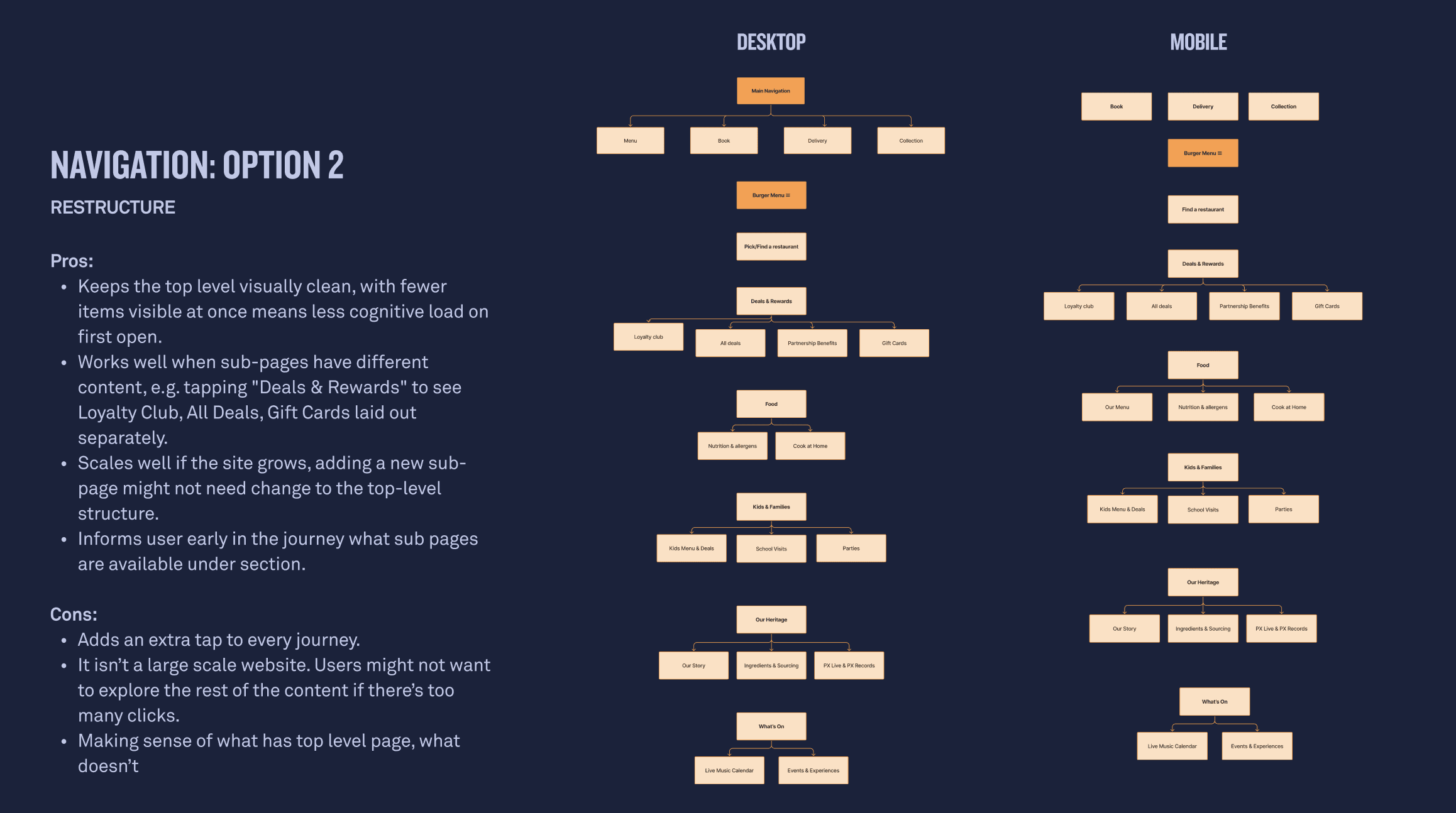
Alongside the audit, I looked at how other brands were approaching similar challenges, benchmarking booking flows, digital menus and loyalty experiences to see what worked well elsewhere. I mapped out user flows for key journeys, like browsing the menu, booking a table and exploring offers, and used these to shape a proposed sitemap for the new structure.
I presented all of this back to the team, along with the key opportunities for improvement, and used their feedback to shape the first drafts of the new design. For the heritage page, I did a freeform editorial exploration, which my senior then used to elevate both the homepage and the parties page further.


Getting It Ready
For the menu, I designed a few different versions of the cards and filters so we could see which direction PizzaExpress responded to best. Once the direction was settled, I made sure everything was consistent and properly prepared for handover, applying the correct styles and spacing across both desktop and mobile. From there, the designs were handed over to PizzaExpress to implement in a way that aligned with their timeline, whether that meant rolling out the new direction in full or introducing it in stages.